ED.GOV
The Department of Education’s website is bloated, convoluted, and disorientating: utterly devoid of any apparent planning or architecture. It was my goal to analyze and reconstruct this website in order to improve the its navigation and functionality.
THE DEPARTMENT OF EDUCATION
WEBSITE REDESIGN
UX/UI CASE STUDY
SOLO PROJECT
FIVE WEEKS
TOOLS USED
Miro, XD, Photoshop, Google Suite (Sheets, Slides, Forms, Docs, Drive), Web AIM, Prepostseo, Digital Color Meter, Giphy Capture, Google Fonts, Zoom, FaceTime, Reddit
The Solution
The Problem
Education needs to be widely accessible to all who live within the United States, and taught by teachers who share the same curriculum and hope for their students’ success.
The Department of Education’s website and the United States’ educational system has been spread thin and grown frail. regions over the years, but the COVID-19 pandemic has torn at its very being and lead us all to question education. I interviewed teachers, students, and parents across the United States, and the data that I found represents an educational system that is pleading for help.
You can view this entire project in a zoomable whiteboard.

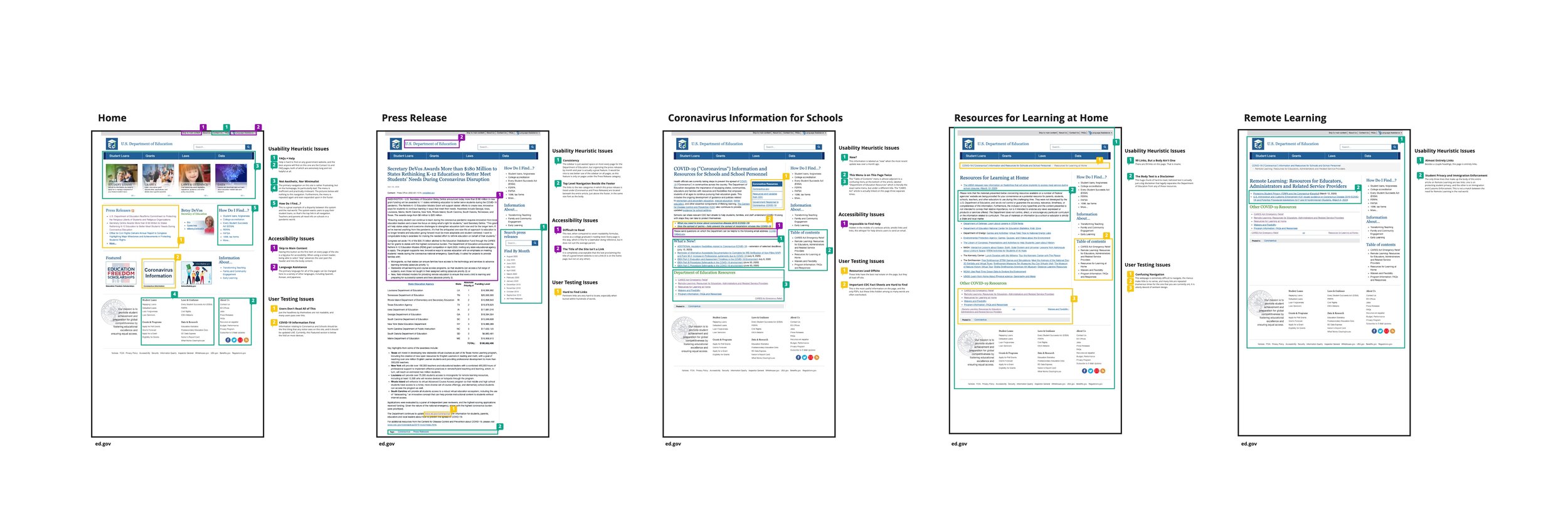
Usability Analysis
I started by analyzing the current website’s accessibility, usability, and navigation.
Most pages are extremely wordy and lack any real visual or textual hierarchy.
Resource pages, in particular, have an outlandish number of links.
37% of text fails accessibility tests
37.5% of the text colors used on the government site failed the WCAG AAA guidelines when compared to the white background.
Grade 18.8 reading level
Readability of all of the pages along our user path averaged at an 18.8 grade level - only suitable for college graduates and above.
Annotations
It all begins with an idea. Maybe you want to launch a business. Maybe you want to turn a hobby into something more. Or maybe you have a creative project to share with the world. Whatever it is, the way you tell your story online can make all the difference.
Don’t worry about sounding professional. Sound like you. There are over 1.5 billion websites out there, but your story is what’s going to separate this one from the rest. If you read the words back and don’t hear your own voice in your head, that’s a good sign you still have more work to do.
Navigation Evaluation
It all begins with an idea. Maybe you want to launch a business. Maybe you want to turn a hobby into something more. Or maybe you have a creative project to share with the world. Whatever it is, the way you tell your story online can make all the difference.
Usability Testing
I tested the accessibility of the Department of Education’s website with five users - two of which were on a mobile device, and the others were on a laptop.
All of the users had significant trouble navigating the website.
One user got lost in the Data Resource section, trying to locate resources for learning at home.
Another user past by a search bar on numerous occasions, continuing to browse for the exact term he was searching for, but overlooking useful links because of the technical terms used to describe the articles.
Several users were amazed at the number of links present on one page.
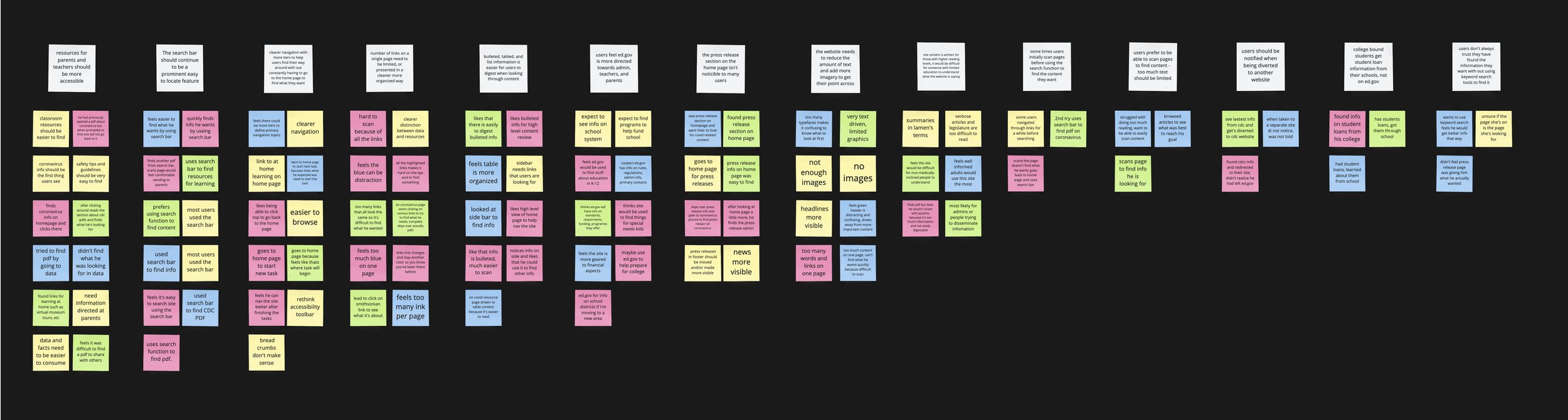
After creating an affinity board with all of my user feedback and issues data points, I determined four areas that were the most problematic and were to be my focus in improvement.
Content
Navigation
Organization
Primary Users
Content
Resources for parents and teachers should be more visible.
The site needs to reduce the amount of text and use more images to get their point across.
Chunking information and using more textual hierarchy will also increase the readability of the site.
Primary Users
At this time, Ed.gov is directed more towards teachers, educators, and administrators.
College-bound students get their student loan information from their prospective schools, not Ed.gov.
The site’s content is written at a very high reading level, so it would be difficult for anyone with a limited education to understand what the site is saying.
Navigation
There are numerous forms of navigation present on the current site, and they all lead to confusion.
Navigation needs to clearer, with multiple tiers and breadcrumbs, so that users can find their way around with ease.
Users should be notified when they’re being directed to another site.
Organization
The number of links on a single page needs to be limited, and/or presented in a much cleaner and more organized way.
Information reads best when in the form of bulleted or numbered lists.
The home page is poorly organized and has little to do with the needs and searches of its users.
User Research
Personas
Based on my user research, I generated three personas to represent the most prominent users of The Department of Education’s website.
The Teacher
Teachers are the most common users of the ED.GOV website, visiting frequently to check standards or policies.
The Student
Many high school seniors and juniors come to apply for the FAFSA and compare college rankings.

The Parent
Parents use the site least frequently, primarily to research schools and help their teenagers apply for the FAFSA.

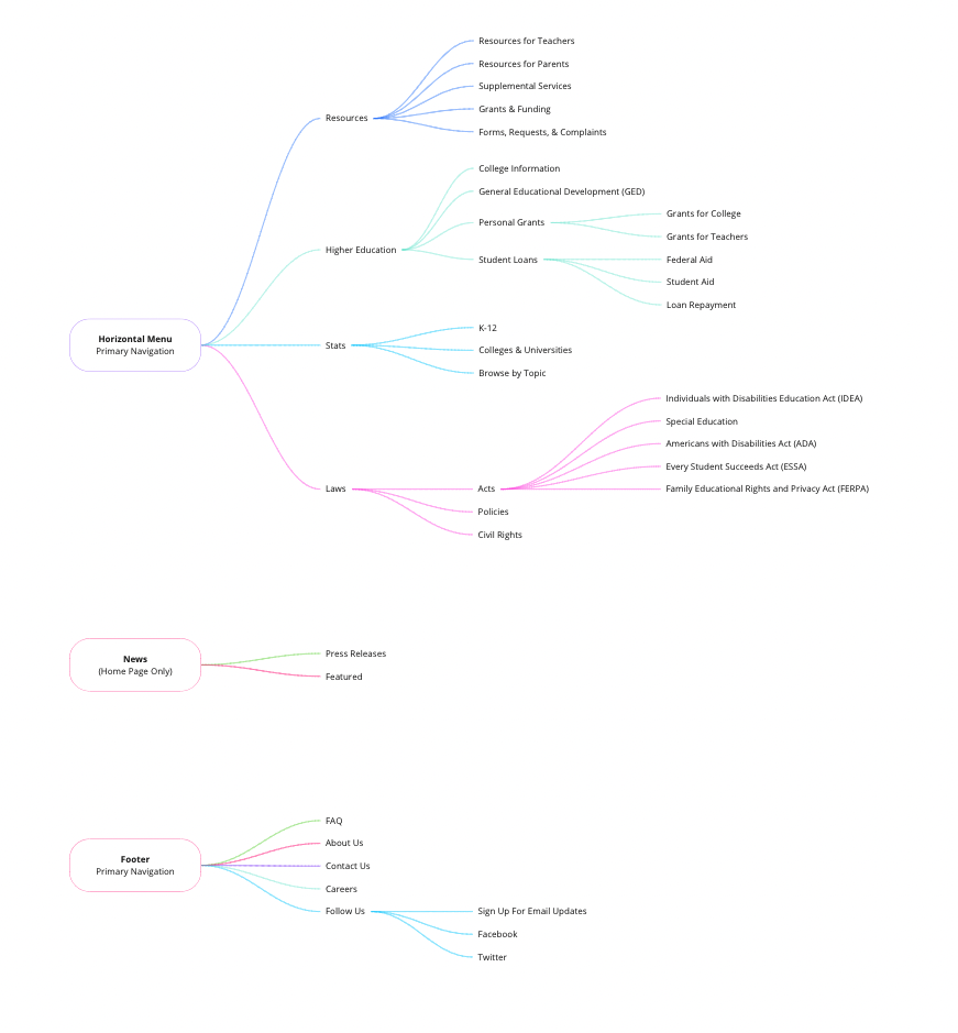
Information Architecture
Site Map
It all begins with an idea. Maybe you want to launch a business. Maybe you want to turn a hobby into something more. Or maybe you have a creative project to share with the world. Whatever it is, the way you tell your story online can make all the difference.