
Gabbi
Gabbi is a mobile application that uses an AI to estimate the user’s risk for breast cancer, and then make recommendations for future treatment. This project had an extensive onboarding process that was crucial to determining a user’s potential risk. Future state aims to connect users directly with doctors to give a true diagnosis and suggest next steps.
I collaborated with Helpfully Inc. on this project.
MOBILE APP DESIGN
COLLABORATION
HELPFULLY, INC.
FIVE WEEKS
TOOLS USED
Figma, Miro, FlowMpp, Photoshop, Stark, Tailor
I came into this project in the early stages of design. I had been contacted by Helpfully Inc. to help on a project for a new mobile application - specifically to streamline their onboarding process and refresh the current design. I worked directly with Helpfully as well as the stakeholder’s of the application.
The Solution
The Problem
Optimize the onboarding user flow and encourage the user to reach the finish line, and present the app’s best offerings as soon as possible by delivering a comprehensive risk and action plan so that Gabbi’s users can be more health-conscious and aware than ever before.
This project has a very lengthy onboarding process that new users must work through to full engage with the app’s content and features. With a quickly-approaching deadline, the onboarding must be streamlined to encourage users to complete the process.
Roadmap
We worked through multiple work sessions to
One user
After creating an affinity board with all of my user feedback and issues data points, I determined four areas that were the most problematic and were to be my focus in improvement.
Content
Navigation
Organization
Primary Users

Gabbi’s user journey consists of four main sections.
Onboarding
With a lengthy risk assessment up next, it was crucial for the onboarding to be encouraging and coach the user through the process.
The app’s voice and tone
Risk Assessment
The Risk Assessment can be broken down into three main parts:
The Basics
Medical History
Family History
Results
The
Action Plan
The numb
Competitor Analysis
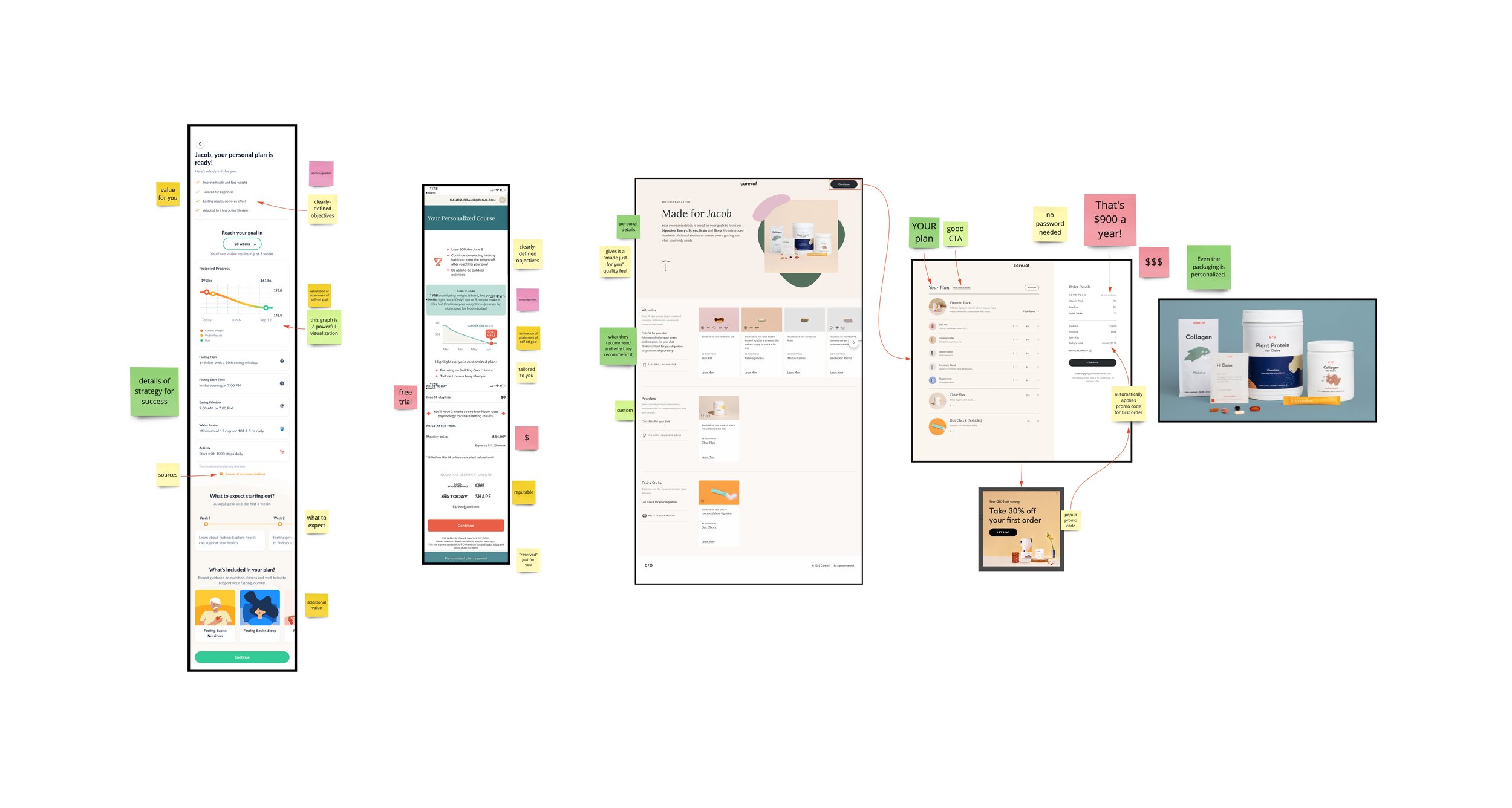
I did a great deal of competitor analysis before diving into design. Gabbi has a very lengthy onboarding and assessment process, so my strategy was to study other applications who also have to meet the challenge of getting new users onboarded before buying their products or services.
Care/of - personalized vitamin packs
65 screens in the assessment, the longest by far.
Personalization to the max - even the packaging has the customer’s name on it.
Noom - weight loss and dieting coach
Highly supportive copy that encourages the user to keep going
Fastic - weight loss through intermittent fasting
All of these applications do a great job of keeping users interested and closing the deal. There are four main traits or features found in all of them that are key to a successful lengthy onboarding.
Be encouraging.
Show progress.
Break onboarding into sections.
Be personable.
I tested the accessibility of the Department of Education’s website with five users - two of which were on a mobile device, and the others were on a laptop.
All of the users had significant trouble navigating the website.
One user got lost in the Data Resource section, trying to locate resources for learning at home.
Another user past by a search bar on numerous occasions, continuing to browse for the exact term he was searching for, but overlooking useful links because of the technical terms used to describe the articles.
Several users were amazed at the number of links present on one page.
After creating an affinity board with all of my user feedback and issues data points, I determined four areas that were the most problematic and were to be my focus in improvement.
Content
Navigation
Organization
Primary Users
The Onboarding
Title
The Action Plan is a crucial section of the app.
The Risk Assessment
The Results
I came into this project in the early stages of design. I had been contacted by Helpfully Inc. to help on a project for a new application - specifically to streamline their onboarding process and refresh the current design. I worked directly with Helpfully as well as the stakeholder’s of the project.
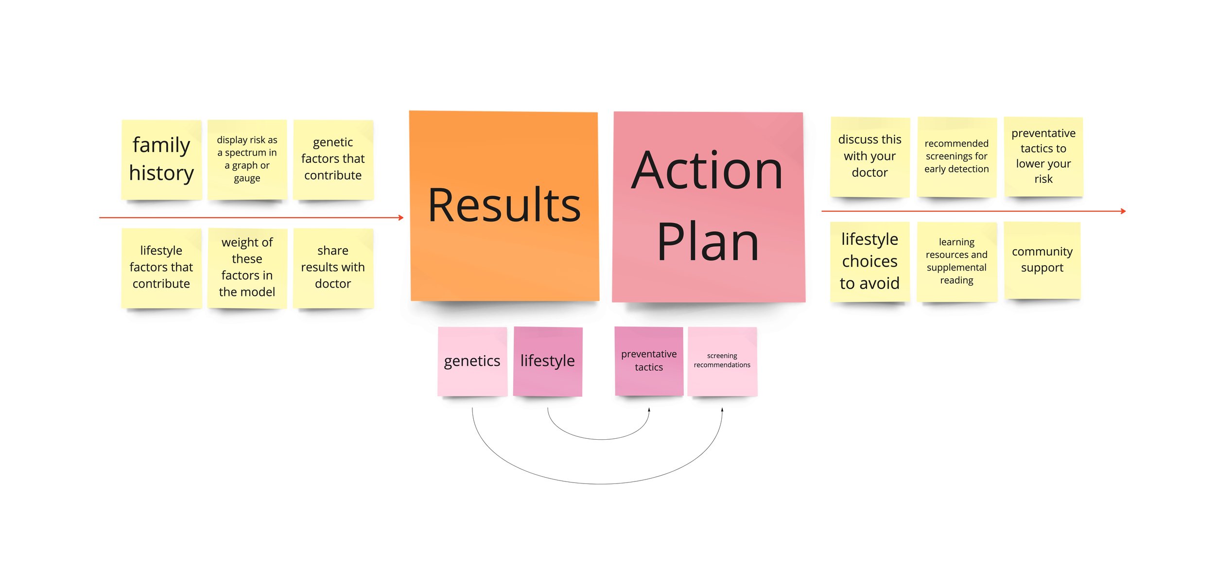
The Action Plan
The Action Plan
Take a minute to write an introduction that is short, sweet, and to the point. If you sell something, use this space to describe it in detail and tell us why we should make a purchase. Tap into your creativity. You’ve got this.
Prototyping
It all begins with an idea. Maybe you want to launch a business. Maybe you want to turn a hobby into something more. Or maybe you have a creative project to share with the world. Whatever it is, the way you tell your story online can make all the difference.
