

Pet Buddies Food Pantry
Pet Buddies Food Pantry is a nonprofit organization that helps pet owners in financial distress by supplying pet food, spay/neuter services, and some medication. We redesigned their website to help recruit volunteers and donors, and to streamline the process of applying for aid.
NONPROFIT ORGANIZATION
WEBSITE REDESIGN
THREE WEEKS
TEAM
Before
Pet Buddies is having trouble recruiting more volunteers, and lacks the ability to process all the requests that they get. In addition, their website is difficult to navigate, has poorly designed forms, and - on a base level - feels very inaccessible.

After
Our solution was to improve the usability and functionality of the Pet Buddies website in order to help increase efficiency and awareness for the organization.

You can view this entire project in a zoomable whiteboard.

Research
Our first step in redesigning the Pet Buddies website was to gain a more thorough understanding of those who would access it: volunteers, donors, and beneficiaries. In addition to an online survey, we conducted five in-depth interviews with pet owners. Our interview objectives included understanding who uses the website the most, why they use the website, and how they felt about the design of the current website.
User Needs
Service Beneficiaries
Need pet supplies, medical procedures and support, and don’t have the means to afford them right now.
Need to understand what services are available for their pets.
Need to be able to complete applications for services with relative ease.
Volunteers
Need information about volunteering with Pet Buddies - what they will be doing, where, and when.
Need to fill out and submit applications to volunteer.
Need to fulfill community service requirements.
Sponsors & Donors
Need to connect with a nonprofit organization that helps pets and pet owners.
Need to see how their contributions can make an impact.
Need to be able to quickly find information on how to donate food and supplies, and how to support the organization monetarily.
Survey
While almost all would turn first to their family and friends when in need of pet assistance, a third of respondents indicated that they would contact a pet shelter or outreach program.
58.6% of pet owners have felt stressed by the costs of caring for a pet.
31.6% would turn to a pet outreach program or shelter for assistance.
6.9% had to give up a pet in the past due to challenging circumstances.
Two respondents indicated that they have had to choose between food for themselves or for their animals.

Interviews
“The website seems amateurish and unprofessional.”
There were numerous comments about the current Pet Buddies website's aesthetic and UI. The wide variety of text colors and the inconsistent styling was mentioned most frequently.
“I like the whole idea of reaching out to people who have pets in need.”
Many of the interview subjects expressed their approval of a pet assistance program and the other resources for animals.
“There was a time when it was hard to get them to the vet and get their heart worm medication.”
A quarter of the participants said that they had experienced difficulties caring for their pets when in a tough financial situation, particularly when concerning medication and veterinary expenses.

Persona
Based on our findings, we created a user persona to represent a typical beneficiary of the food pantry, as well as a scenario to illustrate her needs, pains, and goals.
It’s important to note that Kacey and her little brother do not view their pug as just their pet, but as a full-fledged member of their family.

Analysis
Next, we analyzed every page of the current website and found several major problems.
The pages are too crowded, overwhelming.
There are numerous inconsistencies in the navigation between different pages within the site.
The copy lacks any real hierarchy, and thus, is very difficult to read.
All of the images are of inconsistent shapes and sizes.
Every single font color (besides black) failed at least one AA or AAA contrast test.

Ideation
Sketching
We took a very democratic approach to our group ideation, sketching and wireframing in rounds, and then voting on our favorite aspects of each others' work. Tabs for easy navigation, a powerful hero image, and a clean presentation of the non-profit's sponsors were all things that we found to be critical in our redesign.

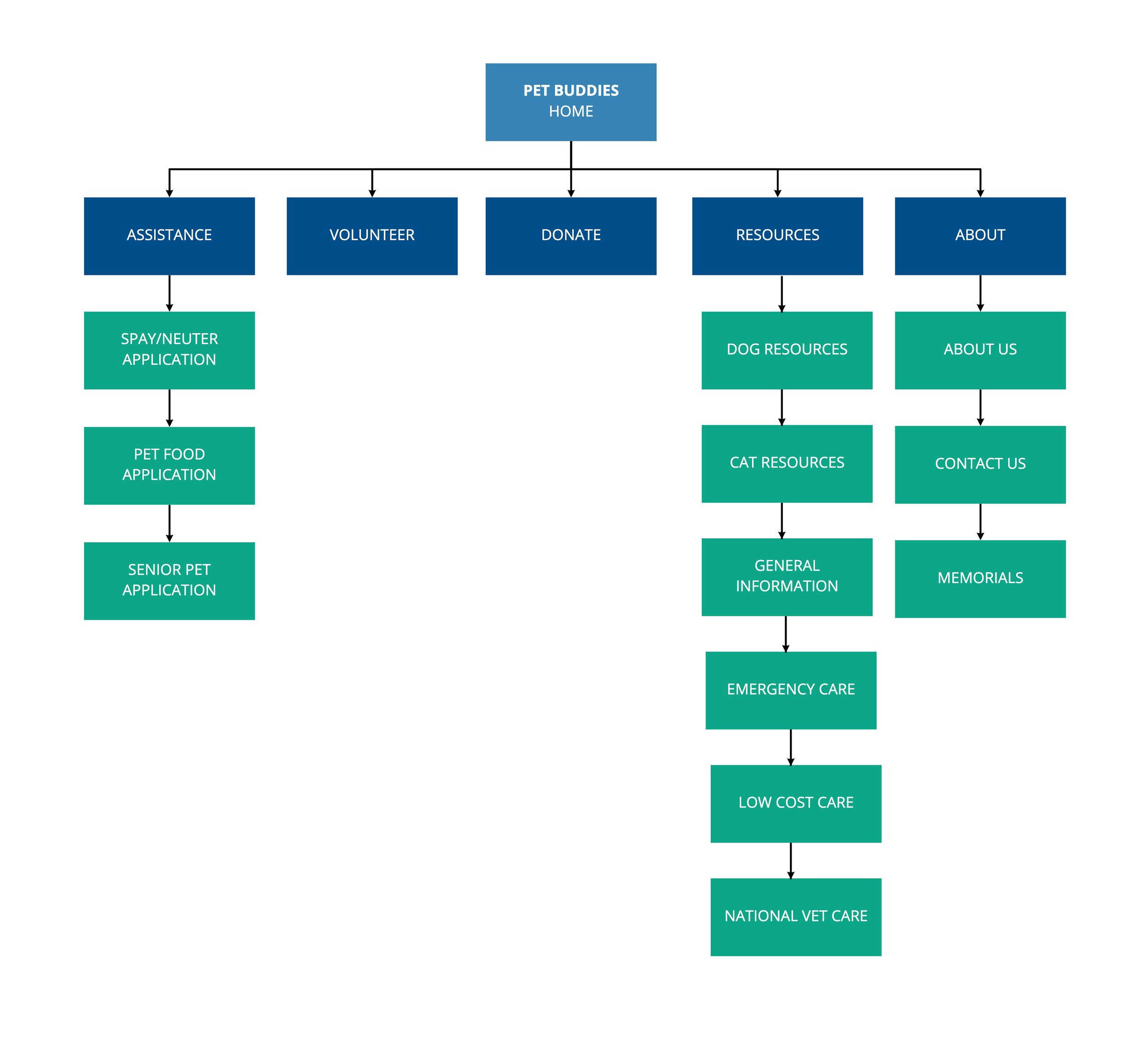
Architecture
we created a new site map that would streamline the path of all three types of users visiting the site.
Prototyping
During prototyping, we separated into three individual roles, with myself as visual design lead. Every aspect of the website was designed on a balanced grid layout.
As we advanced with our prototyping, we created a well-defined style guide for a styling that embodied the Pet Buddies ideals: love, hope, and community.

We selected a calm cool color scheme of blues and green: both calming, peaceful colors. We wanted our website to evoke peace, trust, health, and wellbeing.
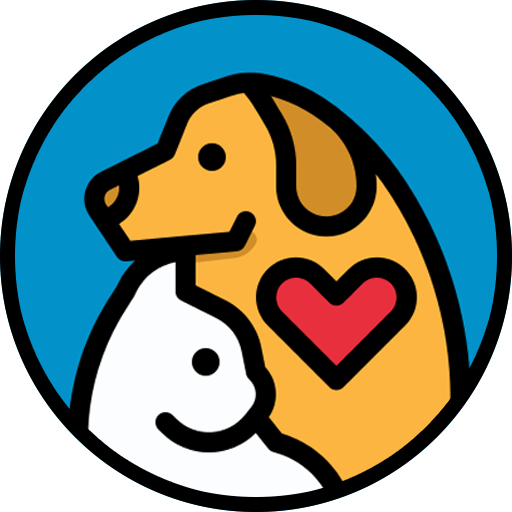
The old Pet Buddies logo was very cluttered, and included elements too complex to easily render or print.
I created a new logo that aimed to reflect the Pet Buddies mission and ideals. Very clearly, this image represents the love that we all share for our pets.

User Testing
Forms are too long.
Many test subjects found the forms to be very lengthy. This could deter some applicants from completing the application.
Break down the forms into a few separate pages, and display the user’s progress.
Some language is not as clear as intended.
Some of the copy - particularly within the forms - can be confusing to some readers. Clear and concise copy will ensure that forms are filled out correctly.
Clarify copy throughout the website, and increase readability with more direct wording.
Users need more feedback from submission buttons.
Some users expressed that they didn’t receive enough feedback when completing the form, causing them to question if it “went through” or not.
Design micro interactions for SUBMIT buttons, and create custom pages for successful submissions that bring the user back to where they started.
Final Product
Our final high-fidelity prototype was a great success. I loved witnessing its development from sketch to final prototype firsthand, and I’m very proud of the work that my group members and I created.
Tabs for easy navigation.
Hero image of lovable pet.
Newsletter signup above the fold.
Noticeable CTA to donate in the top right.
Cards to clarify services offered.
Volunteer signup.
Clean display of sponsors.
Working on a nonprofit project was both challenging and rewarding, and something that I would love to do again.
In the future, I wish that I could work more closely with the actual organization so that our work could make a real world impact.
